UH RepCompanion
What is UH RepCompanion?

UH RepCompanion was developed as the final project for the course ICS 314: Software Engineering I, where our team created a web application enabling University of Hawai’i students to find compatible gym partners for on-campus workouts. Following Issue Driven Project Management (IDPM), a form of Agile Project Management (APM), we distributed task assignments, held regular team meetings, upheld thorough documentation, and worked via milestone-based progress tracking. The application itself allowed students to register with their UH email and create profiles including name, major, bio, profile picture, workout interests, experience level, and optional social media links. Users were able to track their workouts, browse upcoming workout events, connect with other participants, and search profiles to find partners with similar interests or experience levels. Essentially, UH RepCompanion acted as a fitness-focused social platform, helping students to plan workouts and build connections with gym partners.
Milestone 1
For the first milestone (M1), each team member was assigned tasks that contributed to the foundational development of the application. My responsibilities as the lead Front-end Developer included designing the Landing Page, Profile Page, and Edit Profile Page.
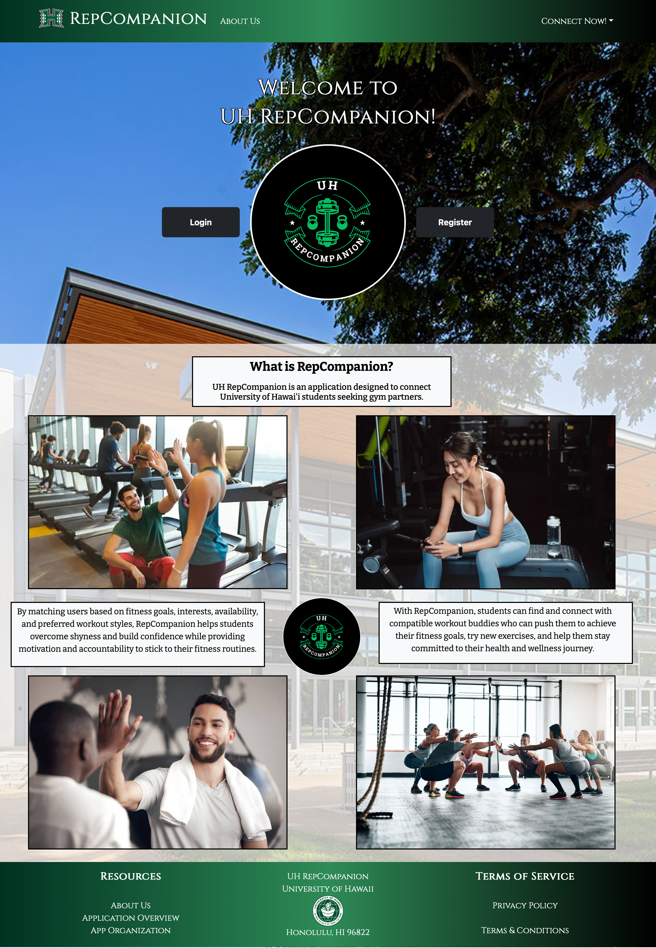
The Landing Page served as the central hub of the application, providing first-time users with a clear and welcoming introduction to UH RepCompanion, as well as access to login and registration. I focused on creating an intuitive layout and functional navigation to ensure a seamless user experience while laying the groundwork for future stylistic enhancements.
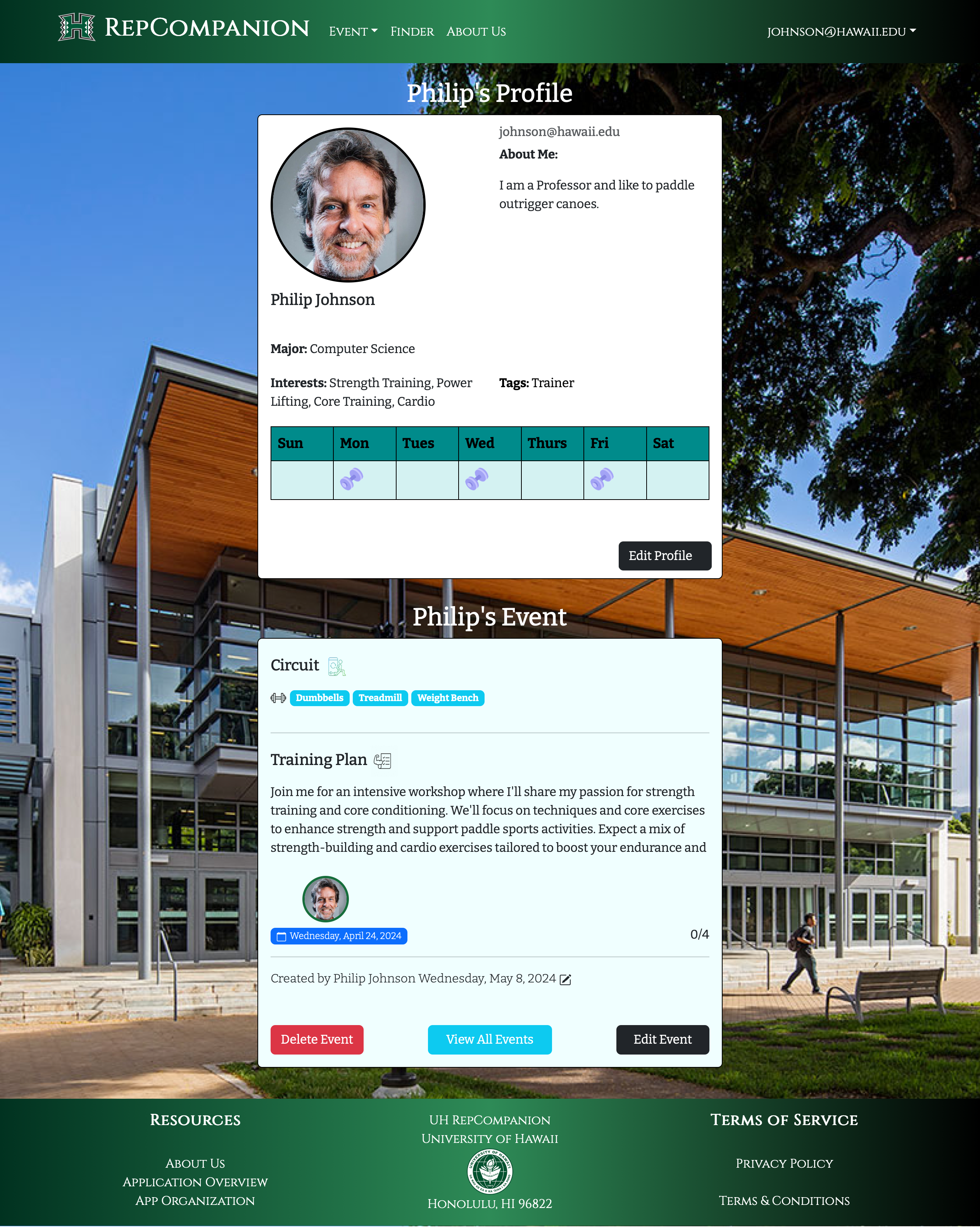
The Profile Page displayed user information from the database in a clean, readable card format, while the Edit Profile Page allowed users to update their information, with changes saved directly to MongoDB. Additionally, I designed a recognizable logo to establish a visual identity for the application. This milestone established the core structure of UH RepCompanion, providing a solid foundation for subsequent features and design improvements.
View Milestone 1 Project Board: https://github.com/orgs/UH-RepCompanion/projects/1
Milestone 2
In the second milestone (M2), I focused on enhancing the Landing Page and implementing key features to improve user engagement and functionality. I revised the layout and styling of the Landing Page to provide a clearer, more intuitive introduction to UH RepCompanion, including updating navbar access to other pages. I also incorporated visual elements through UI/UX design, such as personally created images and graphics, to give users a professional, gym-inspired aesthetic and a clear understanding of the app’s purpose.
In addition to the Landing Page improvements, I implemented a weekly calendar feature on the Profile Page. This feature allowed users to track their planned workouts by clicking a day to display a dumbbell icon, creating a personal routine. The calendar integrated with user-created Events on the Events Page, which included workout details such as date, description, equipment, and creator. These events appeared on the user’s profile, enabling other users to view schedules and connect with workout partners with similar schedules.
This milestone was a significant step in shaping the application’s structure and introducing major interactive UI/UX features, setting the foundation for the more advanced functionality and design enhancements implemented in the third and final milestone (M3).
Milestone 3
In the third and final milestone (M3), I focused on enhancing user profiles, improving the user interface (UI), and adding advanced functionality to UH RepCompanion. Key tasks included implementing a way for users to include social media links in their profile, updating the informational application footer, enabling dynamic profile picture sizing, linking the weekly calendar to users’ schedules, styling event cards, and improving accessibility for the Events and Finder pages.
To implement social media links, I updated the Profiles collection so that links submitted upon registration or through profile edits would be tied to a user’s account in the database. I then added validation checks to ensure that submitted URLs matched supported social media platforms, including Instagram, Discord, LinkedIn, Snapchat, Facebook, and Twitter. On the Profile Page, only the social links provided by the user are displayed as clickable icons, each linking directly to that user’s respective social media page.
Here’s how a user’s social media links were rendered within the code:
  const renderIconForSocialLink = (platform, link) => {
    if (link) {
      let IconComponent;
      let url;

      switch (platform) {
      case 'Instagram':
        IconComponent = Instagram;
        url = `https://instagram.com/${link}`;
        break;
      case 'Discord':
        IconComponent = Discord;
        url = `https://discord.com/${link}`;
        break;
      case 'LinkedIn':
        IconComponent = Linkedin;
        // eslint-disable-next-line no-unused-vars
        url = `https://linkedin.com/in/${link}`;
        break;
      case 'Snapchat':
        IconComponent = Snapchat;
        url = `https://www.snapchat.com/add/${link}`;
        break;
      case 'Facebook':
        IconComponent = Facebook;
        url = `https://www.facebook.com/${link}`;
        break;
      case 'Twitter':
        IconComponent = Twitter;
        // eslint-disable-next-line no-unused-vars
        url = `https://twitter.com/${link}`;
        break;
      default:
        // If the platform is not recognized, return null
        return null;
      }

      // Render the icon with the corresponding link
      return (
        <Col xs="auto" className="text-center" key={platform}>
          {/* eslint-disable-next-line jsx-a11y/control-has-associated-label */}
          <a href={link} target="_blank" rel="noopener noreferrer">
            <IconComponent className="mt-2 icon" />
          </a>
        </Col>
      );
    }
    return null; // Return null if the link is not present

  };

  // Function to render icon links based on social media platforms
  const renderSocialLinks = () => (
    <Row>
      {profile && (
        <>
          {renderIconForSocialLink('Instagram', profile.socialLink1)}
          {renderIconForSocialLink('Discord', profile.socialLink2)}
          {renderIconForSocialLink('LinkedIn', profile.socialLink3)}
          {renderIconForSocialLink('Snapchat', profile.socialLink4)}
          {renderIconForSocialLink('Facebook', profile.socialLink5)}
          {renderIconForSocialLink('Twitter', profile.socialLink6)}
          {/* Add more social links as needed */}
        </>
      )}
    </Row>
  );
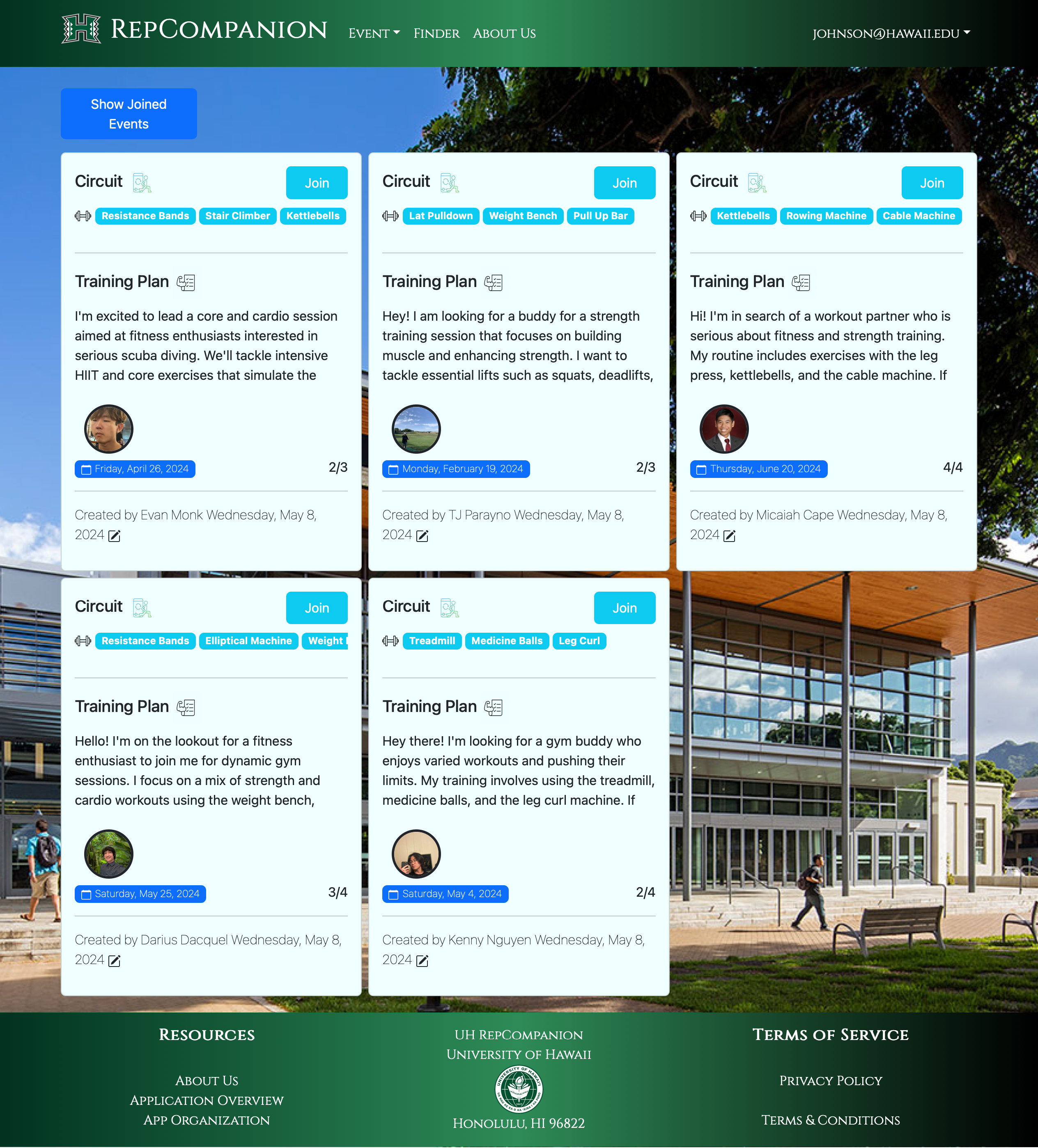
I also refined the Landing Page layout, incorporating stylized Greek pillars to align with the fitness theme, and updating the informational content to clearly communicate the purpose of UH RepCompanion. Profile pictures were also fixed to dynamically maintain circular sizing regardless of original dimensions. The weekly calendar was also updated to integrate with user schedules so planned workouts automatically displayed on the profile calendar. Event cards were enhanced with icons and colors, and login buttons were replaced with direct links to the Events and Finder pages once users are authenticated.
This milestone was the most complex, coordinating multiple backend and frontend enhancements, and significantly improved usability, interactivity, and the overall finalized polish of the application.
View Milestone 3 Project Board: https://github.com/orgs/UH-RepCompanion/projects/17
Closing Thoughts
Working on UH RepCompanion provided me with valuable insights into collaborative software development in a professional context. This project strengthened my communication skills, emphasized the importance of documentation, and highlighted effective time management and organizational skills in a team setting.
Following Issue Driven Project Management (IDPM) allowed our team to build the application iteratively, addressing challenges systematically and managing merges efficiently. Technically, I gained experience in web application deployment, database integration, and feature implementation, such as the weekly calendar—ultimately helping me develop my skills in software engineering, front-end and back-end development, and UI/UX design.
Overall, this project enhanced both my technical and soft skills, deepened my understanding of real-world software engineering workflows, and prepared me for future development projects and professional growth in the field.
You can explore the final deployed application here:
https://uhrepcompanion.site/
To view the project overview and documentation, visit:
https://uh-repcompanion.github.io/
For the full source code and technical details, see the GitHub repository:
https://github.com/UH-RepCompanion/RepCompanion-1
(Note: Based on the time period in which you are attempting to access the deployed application, it may no longer be accessible.)